 2011 was a crazy year to be an investor.
Even someone with relatively small portfolios could have lost thousands of pounds in a month. I know I did!
I recently came across a great info-graphic that sums up the year well, particularly the fact that low-cost funds out-performed higher cost funds. You may think this is obvious but when looking to invest, the higher cost funds are the funds that have advertising budgets and marketing designed to make you pick them over cheaper funds.
There will be more posts at Magical Penny explaining how to invest in low-cost funds so be sure to sign up for updates but, for now, enjoy the info-graphic.
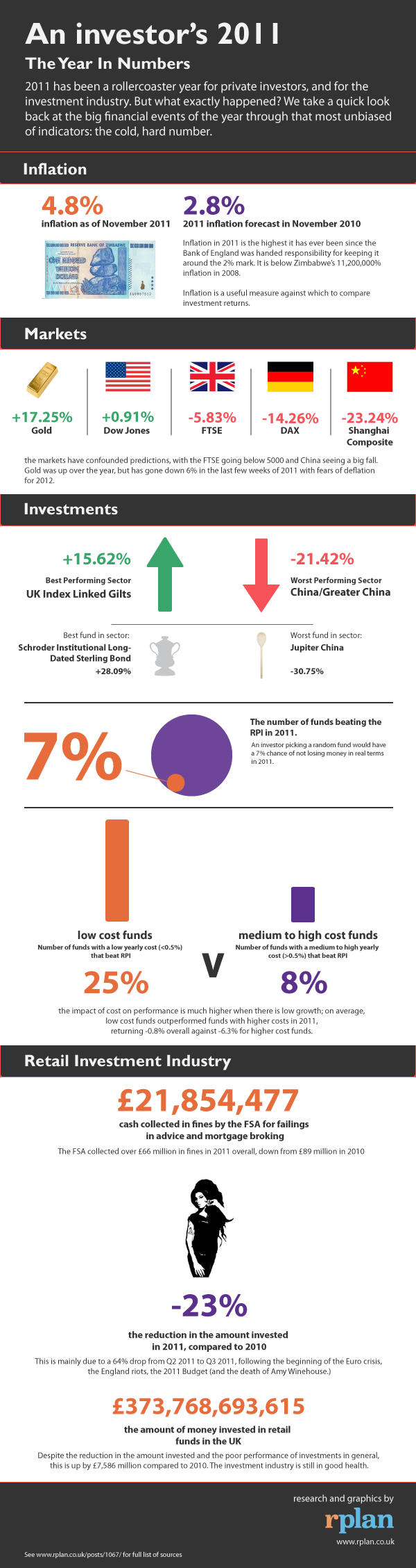
Source: https://www.rplan.co.uk/post/1067/an-investor-s-2011-the-year-in-numbers-infographic
Which figure surprised you the most?
Leave a comment below.
Other Magical Penny articles you may like:
{ 1 comment… read it below or add one }
The overall inflation rate has seemed as if it would have been higher. Thanks for the post. You’re right-good graphic.
You must log in to post a comment.