Investing in the markets is one of the best things you can do to grow your money.
Every day companies create value in the world and by investing in the stock market you have an opportunity to own part of those companies.
As an avid investor I’m always looking for better ways to achieve my investment goals. The internet has changed everything for investors as you can have information about investments at your fingertips unlike ever before.
But are you investing right?

When you think about investing what comes to mind?
A much better option is investing in a wide selection of companies that have been grouped together into a ‘mutual fund’. By buying a share in a mutual fund you essentially own tiny proportions of many different companies. Over time, most companies make money (or they wouldn’t exist for long) so you get to benefit from the average growth without worrying about losing all your money in the few companies that get into financial trouble.If you are like most people, you associate the word ‘investing’ with buying shares in individual companies. However, for most, this is not a good option unless you are willing and able to do in-depth research into the balance sheets of publicly traded companies.
Think of it as ‘Less-stress-Investing’.
But not so fast…there still is work to do…
The trouble with mutual fund investing
It is easier than ever to set up a portfolio made up of mutual funds. But, unfortunately, with all this information available it is also easy to get overwhelmed when tracking an investment portfolio – how the various funds are performing, and how much they are costing you.

Enter rplan
rplan are a startup company based in London that aims to simplify the process of keeping track of your investment portfolio.
They have recently developed a new tool for users to create and track investment portfolios. The tool is still in the testing phase, but Magical Penny was offered an opportunity to try it out and offer feedback for the rplan blogger challenge.
In a nutshell rplan’s portfolio tool is a comparison web app to help you buy the best funds with the lowest fees.
This is incredibly significant because every other investment platform I have ever used, hides the REAL TOTAL COST of a mutual fund. Naturally, investment companies make more money when investors choose mutual funds with higher management fees. But higher fees are no guarantee of investment performance. In fact, over the long term, the amount a fund costs to run has a significant impact on the overall return of your investment.
Using rPlan’s portfolio tool to monitor total expense ratios of a portfolio enables you to become more aware of poor performance, possibly saving you 10s of thousands of pounds over a life-time investing.
Let’s have a look at the tool itself in its current form:
Virtual portfolio planning – Dashboard

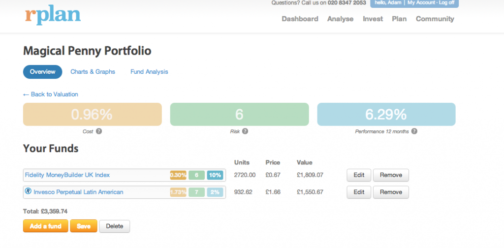
Portfolio Overview
As you can see above, the main portfolio dashboard is centred around 3 key metrics, represented by the yellow, green and blue boxes in the centre of the page. These key metrics are paramount when it comes to portfolio management so it’s great to see rplan recognising this on their dashboard:
- Total Expense Ratio
- Risk
- Performance
1. Total Expense Ratio
I felt pretty smug with my discovery.
Result.
Suggested Improvements
If a portfolio is displaying unusually high expenses ratios, it would be great if the tool displayed a warning sign with an explanation about how expense ratios can cause a significant performance lag against benchmarks. Educating the consumer on expense ratios should be a priority. There’s a reason why rplan chose expense ratios as the first box on the dashboard, so flagging unusually expense portfolios would be hugely beneficial as many new investors would not have developed a frame of reference to know if the expense is higher or lower than others.
2. Risk
The second box on the dashboard is a risk score. As rplan explains, it’s really the Synthetic Risk and Reward Indicator (SRRI), which measures the volatility of the fund. A higher volatility means there is greater uncertainty about the size of the changes in a fund’s value. Getting your head around volatility is important to understand what you can expect to see if you were to check your portfolio valuations regularly. It is particularly important for older investors who may be intending to liquidate some or all of their holdings in the coming months as they approach retirement or another life-event that requires selling of investments.
For younger investors in an accumulation stage, volatility is arguably less important, but knowing your score (out of 7 on the dashboard) does allow you to prepare for the ups and downs of the stock market.
Bravo to rPlan for including it front and centre stage – investing is a psychological game, and recognising that volatility is a fact of life is very helpful.
Suggested Improvements
Only semantics really, but I much prefer ‘volatility’ over the word ‘risk’. Many new investors may be scared and search for low ‘risk’ funds, thus likely being directed away from funds with better performance over the long term.
3. Performance
This is the most important figure for most people, because knowing how your investments have performed is the main reason to check a portfolio. Other investment platforms I’ve used have included performance calculators but mostly at a fund level rather than a total portfolio level. That said, only having a 12 month indicator on the dashboard seems a little limiting. I would prefer a way to customise the dashboard to display more meaningful data over a longer period of time, and against a benchmark of my choice (like a FTSE index for example). The graphs and charts tab do offer more ways to look at performance but given how important a performance figure is to an investor, offering more options here on the main dashboard would be very helpful.
Suggested Improvements
Whilst I appreciate the need to keep the dashboard simple and clean, only including 12 month performance is not ideal. It is less meaningful to see performance over such a short time period, as investors typically have much longer investment horizons.
Selecting Funds

The portfolio tool is excellent at making sense of how different funds perform as a single portfolio, but, of course, the tool has to know which funds make up your portfolio.
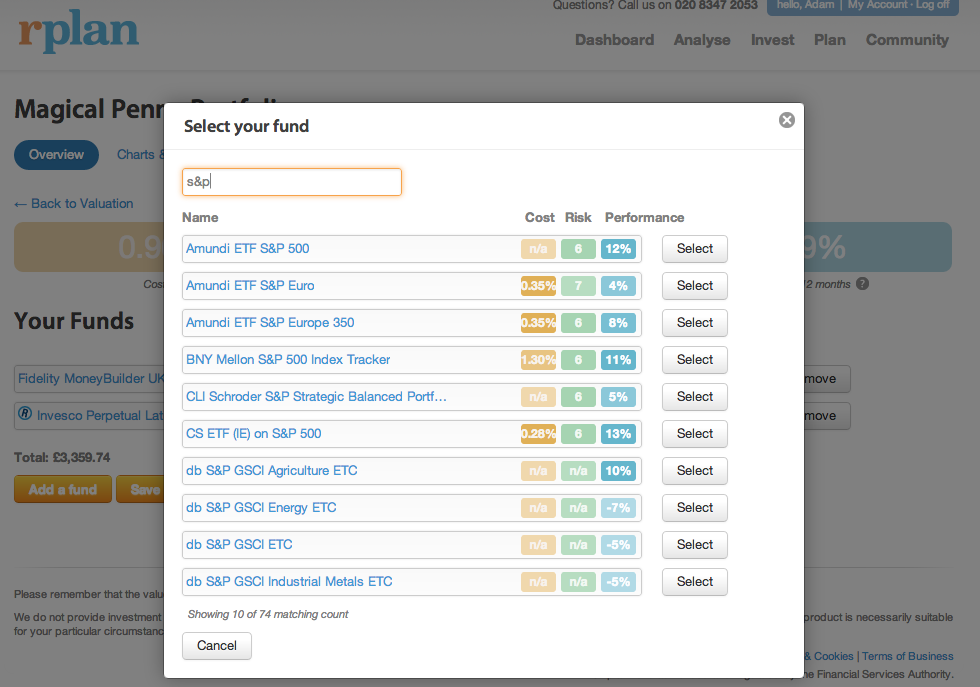
To add funds to your portfolio is simple enough. After clicking ‘Add a Fund’ a search field is displayed and upon beginning to type the fund name, the tool begins searching and displaying possible funds which you can then select.
Crucially though, you have to know what you looking for.
rplan assumes you already have your funds at your investment company, and you are simply telling rplan what you currently have. Whilst there is a fund analysis tool that suggests similar funds to the ones you already have, I feel this initial fund search menu misses an opportunity to help investors find new funds that may be fit their needs. Being able to search across the key parameters of cost, risk and performance would be great, as well as other things like industry sector and type of fund (accumulation or distribution).
Once you have found your fund (assuming you know what you are looking for), rplan then asks for the number of units so it knows how much your holdings are for each fund. Once this is completed you are done, but I did notice a tiny glitch when I first tried adding in unit values: the field where you input the number of units does not respond well to commas. This is important because some investment platforms include commas on their summary pages. I imagine other users are going to do what I did, and copy and paste the unit value from their investment account into the unit field in the rplan tool. The commas were not recognised and meant the fund valuation was way off. Only after removing the commas did the tool correctly calculate the fund value. Making the field non-numerical character agnostic would be a safer bet and a better user experience. That said, maybe I’m the only one who is lazy and wanted to copy and paste my unit values!
What else is out there:
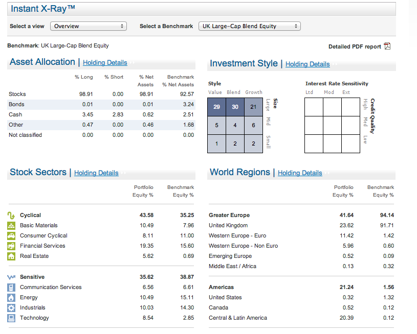
The tool that rplan has created is clearer than any I have seen before for analysing a portfolio that includes multiple funds. Until rplan came along, I was using Fidelity’s Portfolio X-Ray tool to do a similar job, but significantly it was very difficult to look at performance and damn near impossible to keep tabs on expense ratios.
Here’s a screen shot from Fidelity’s Portfolio X-ray:

As you can see, this portfolio tool is interesting but it doesn’t highlight performance or expense ratios! But as it is integrated into my investing account, it is always accurate, automatically… which brings me onto the possibly fatal flaw in the rPlan tool…
Manual Updating – and some possible solutions
rplan’s tool, is just that – a tool to help you understand your portfolio (or simulated ones). It’s strength is that it focuses on the key metrics an investor needs and displays the data beautifully. But if my portfolio were to change, I would need to edit the number of units manually.
As someone who advocates regular monthly investing, that means a lot of typing each month as I work out how many more units I need to include for each of my funds.
Whilst the rplan tool is useful, I’m not sure I like the idea of this extra administrative chore every month.
The three options I can see are:
- Perhaps use the tool once or twice a year to double check I’m on track or when I’m evaluating rebalancing or changing my portfolio. This is less than ideal as the performance metrics will be off as the tool won’t know how long I have been in the market for each fund unit.
- Request that rplan integrate with investment companies for transaction data. This is less than ideal because these are rplan’s competitors based on their business model of fund brokerage (as well as searching and adding funds you own on other platforms, rplan provides it’s own brokerage service too. This is how it makes its money to be able to offer a free tool such as this dashboard!)
- 3) Add functionality to the tool to be able to input drip investing instructions so the tool knows how many fund units are being purchased each month based on a £ amount. This is my favourite solution but making this clear and simple to users would be the challenge.
In Closing
I’m thrilled I had a chance to review the rplan portfolio analysis tool. This is the best example of how the web is making investing more accessible to everyone.
The dashboard is clean, easy to read and provides the important numbers an investor needs to understand how a portfolio is performing. I wish I had this tool earlier, rather than having to do the calculations myself when aggregating my individual fund performance and expenses!
If the fund search tool is improved to make fund-shopping easier, and transaction data (real or simulated by a stated monthly contribution) can be included, this tool would be the best on the web for ensuring your investments are in line with your goals and intentions. Thank you rplan!
Want to find out more?
Visit rplan
I loved this video walk through of rplan’s tool
{ 1 comment… read it below or add one }
Thanks very much for the review – I’m glad you liked the tool overall, and thanks for the suggestions on how we could improve it.
Just FYI, if you have an account with rplan, the analysis is automatically connected to your portfolios (so no need to manually update the number of units etc.) You did say this in your review, but I just thought I’d clarify!
You must log in to post a comment.